7 Dec 2009
Audio animation final
things I could improve upon:
1)the rock at the beginning dissapears because the background used colour and it over layered everything else
2) the bra wasn't drawn correctly and looked like sunglasses more than a bra
3) when I made the wizard guy shrink it just looks like I have drawn it wrong and its going out of proportion rather than him shrinking, this could be solved by giving him robot legs that retract
4)the bra should make a puff of smoke before turning in to the wizard hat rather than just morphing.
5) I could have made the mouth change back to the rest position more so that it looked like he was saying individual words rather than one long one and also slowly shifted the mouth position rather than just doing completely new ones on each page.
story boards


lip syncing, I found the following references useful.
one of the things I noticed is how the mouth returns back to its starting position after each word.

audio animation
Before starting anything I mapped out the timing of the audio track on dope sheets so I could get a basic of idea of when things needed to happen.I found referring to the dope sheets when doing my animation very useful, it helped me space out when things had to start and end for example how long I have for the character to raise his arm up and then put it back down before he starts speaking.


setting/mindmap


for the background I eventually decided with mars because it suited the confusion of the main character and the out of context object the bra. here is a reference for the Martian surface that I based my background on


for my character design sheet I decided on a green alien for my main character. after looking at a lot of references for aliens I used large eyes one bigger than the other to make him look slightly crazy. there is also a noise at the beginning of the animation that sounds like gas being released so I used his ears/antenna release a green gas at the start. I initially thought of having him remove a space helmet but this would take up too many frames to do well and so it probably wouldn't go well with the audio track. below are a few references I looked at for aliens.


for my second character I wanted him to appear fairly timid/shy because he didn't say anything in the audio clip, so I decided to go with robots.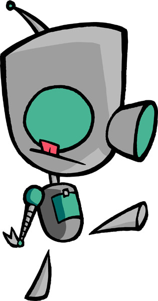 also shown below are some pictures I looked at that helped me come up with the design, for the detatched feet of the robot I got the idea from looking at the robot gir, Jhonen Vasquez's creation.

a drawing on how the bra would look on his head.

wizard hat reference.


setting/mindmap


for the background I eventually decided with mars because it suited the confusion of the main character and the out of context object the bra. here is a reference for the Martian surface that I based my background on


for my character design sheet I decided on a green alien for my main character. after looking at a lot of references for aliens I used large eyes one bigger than the other to make him look slightly crazy. there is also a noise at the beginning of the animation that sounds like gas being released so I used his ears/antenna release a green gas at the start. I initially thought of having him remove a space helmet but this would take up too many frames to do well and so it probably wouldn't go well with the audio track. below are a few references I looked at for aliens.


for my second character I wanted him to appear fairly timid/shy because he didn't say anything in the audio clip, so I decided to go with robots.
also shown below are some pictures I looked at that helped me come up with the design, for the detatched feet of the robot I got the idea from looking at the robot gir, Jhonen Vasquez's creation.
a drawing on how the bra would look on his head.

wizard hat reference.

1 Nov 2009
20 second animation

character design, I sketched out a few different designs and asked what general opinion was on which was the best, I choose the rabbit ear looking one so I could pull him out the ground.
story board:


walk test reference

I looked closely at the reference video and I tried to make sure the knees go forward first followed by the rest of the leg swinging in to line in this short walk test clip. I think it was largely successful however looking at it now I think it could be improved if the steps taken were slightly bigger.
Final animation
anticipation
the purpose of this project was to show anticipation, usually through a short pause in movement before a jump or another action kind of movement. tom and jerry videos are a good example which show anticipation well, in the video below at 0:13 the cat raises the machete high in the air with a short pause to allow people to register what he is doing.
I made a quick story board to plan out what I was doing
I have tried to show anticipation through bending the knees and putting the arms out for balance. I think it would h ave looked better had I gone with some more like tom and jerry and had one of the characters raise some mallet high up and then pause as I have not really used a pause in this video. Although I do think the viewer knows what is going to happen next just before he is about to a backflip due to their position. one thing I could have improved on this was the knees of the man jumping, in the animation below he keeps his knees straight which makes it look unrealistic. I could have also added more images in to the actual jump to make if flow better.
I made a quick story board to plan out what I was doing
I have tried to show anticipation through bending the knees and putting the arms out for balance. I think it would h
 ave looked better had I gone with some more like tom and jerry and had one of the characters raise some mallet high up and then pause as I have not really used a pause in this video. Although I do think the viewer knows what is going to happen next just before he is about to a backflip due to their position. one thing I could have improved on this was the knees of the man jumping, in the animation below he keeps his knees straight which makes it look unrealistic. I could have also added more images in to the actual jump to make if flow better.
28 Oct 2009
timing and spacing
when the ball hits the ground I have made it squash so that it appears to absorb the hit and then stretch again when it is ascending. I have also drawn more images towards the peak of the bounce so that the ball appears to have hang time and weight, this adds to the realism.
I didn't really experiment very much with this animation as I was mainly just trying to get the basic principles down however I would like to do another showing the weight of a heavy ball alongside a lighter one to show I have fully grasped these techniques.
I didn't really experiment very much with this animation as I was mainly just trying to get the basic principles down however I would like to do another showing the weight of a heavy ball alongside a lighter one to show I have fully grasped these techniques.
10 Oct 2009
expressions
first we did portrait drawings exaggerating peoples facial expressions, this helped to provide me with a reference whilst doing my animation to refer back to. I initially started off with more human style sketches but later decided to morph it in to a monster allowing me to concentrate more on the expressions and less on making it look human.


I am fairly happy with the end result I like the over exaggeration on the scared expression. however the shape of the head does gradually changes which could be solved by doing keyframes instead of the start to finish attempt I did here.


I am fairly happy with the end result I like the over exaggeration on the scared expression. however the shape of the head does gradually changes which could be solved by doing keyframes instead of the start to finish attempt I did here.
7 Oct 2009
flip book animation
some of the things I could improve on:
whilst the flip book I used was good for showing other people it was not very good for recording
as it kept moving around even with the use of tape which created shadows that moved and at some points you can see my finger in the corners trying to keep the page down. solution, pay £5.00 for a small piece of plastic (which probably cost 10pence to produce) known as a peg bar to keep the paper in place.
I also noticed that the drawing kept jumping around a lot, I didn't trace this and so I had to guess where the head was on each page. in the future I will use a light box so the image looks more consistent.

Influences
ryan larkin is one of my favourite animators, in ryan the film he uses a technique he has coined 'psychorealism' in which he shows characters emotions and intentions through the use of shape and colour that may extend from the characters, for example when ryan in the film gets angry red spikes protrude from his head. I think this adds a new layer of depth to film that traditional film cannot provide, by blatantly showing all the artists intentions and details of their work it allows the viewer to understand how another person thinks however it does leave less room for individual interpretation.
another influence would be my visit to the natural history musuem in london one of the exhbits was of extinct and strange looking fish, I think this has certainly added to my surrealist style of drawing often with elongated shapes extending from peoples heads.

Subscribe to:
Posts (Atom)